UI Customization
Change the layout and add custom content for all of the team and services in your organization.
Introduction
The default layout of the user dashboard, teams pages, and services pages suit most organizations, but some may want to change what content appears for users, teams, or services, or change the positioning of it. Customizing these pages allows you to select which widgets are visible and the layout of those widgets. Any changes made apply for all users, teams, and services on your account.
Only administrators can customize their account's layouts via the UI Customization page under Settings.
Customizing Layout
From the UI Customization page, you have the option of customizing the content for both the teams and services pages on you account.
For either option, to edit page content and layout, enter Edit mode by clicking the Edit Layout button.
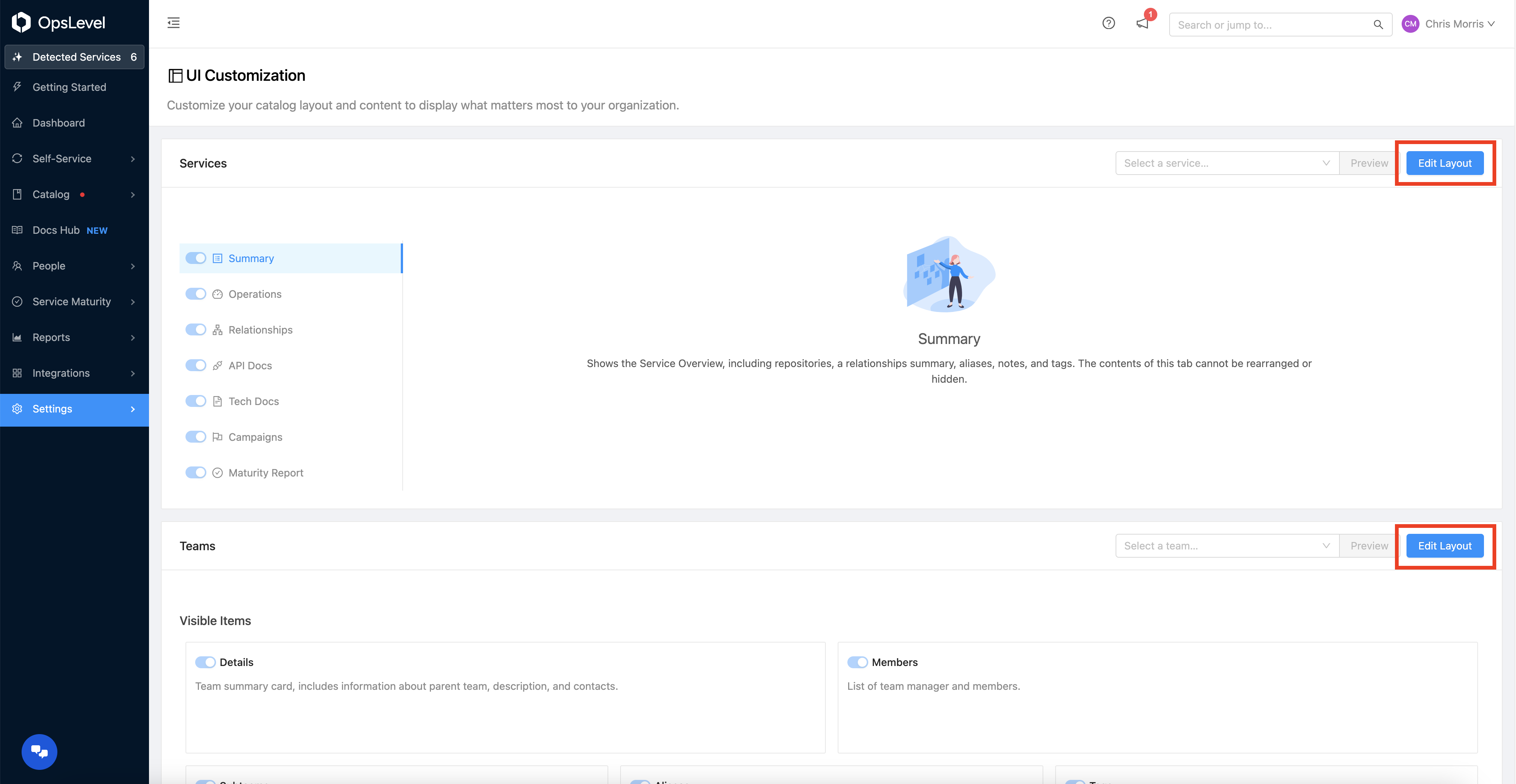
Edit Layout Button
Repositioning
From the Edit mode, you can toggle the visibility of widgets. You can also drag and drop them to rearrange and resize them.
Edit Layout View
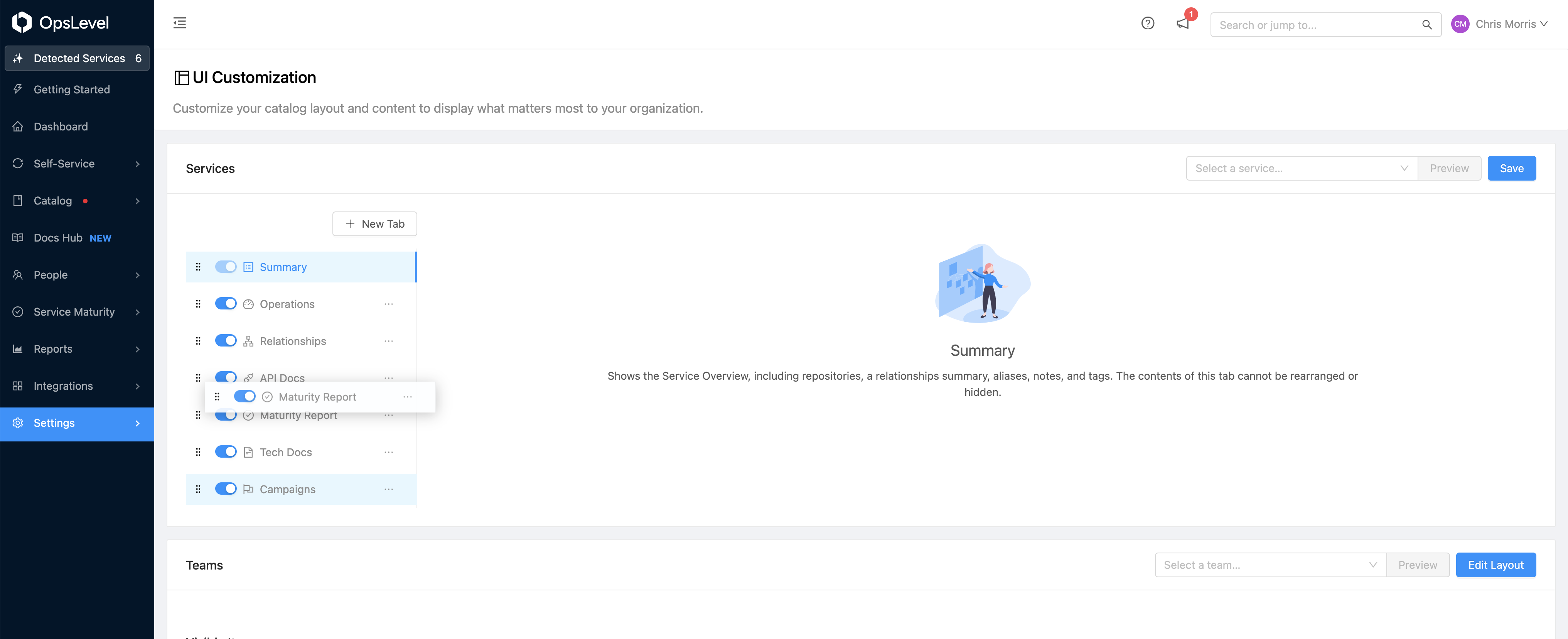
Similar to widgets, when customizing the services page you can toggle the visibility of tabs and drag and drop them to rearrange the tab order.
Edit Service Tab Order
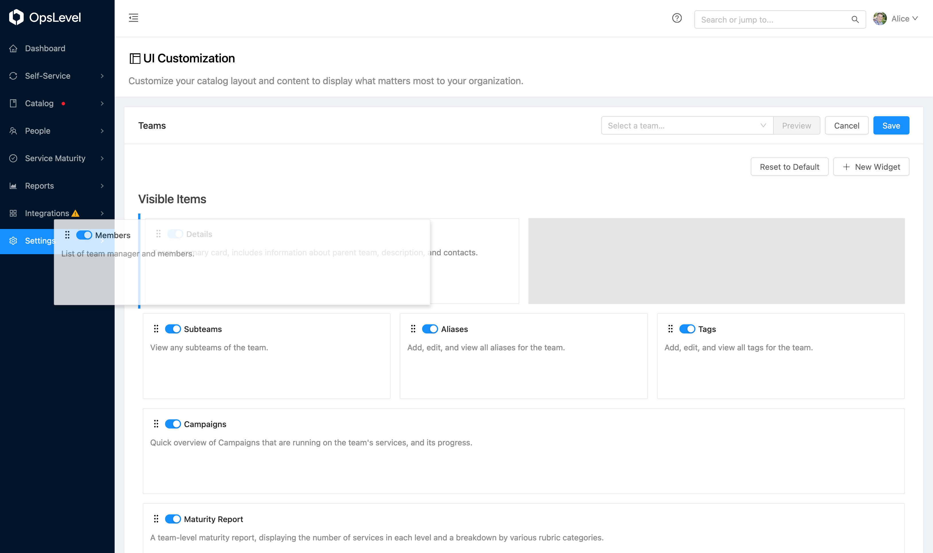
Disabling
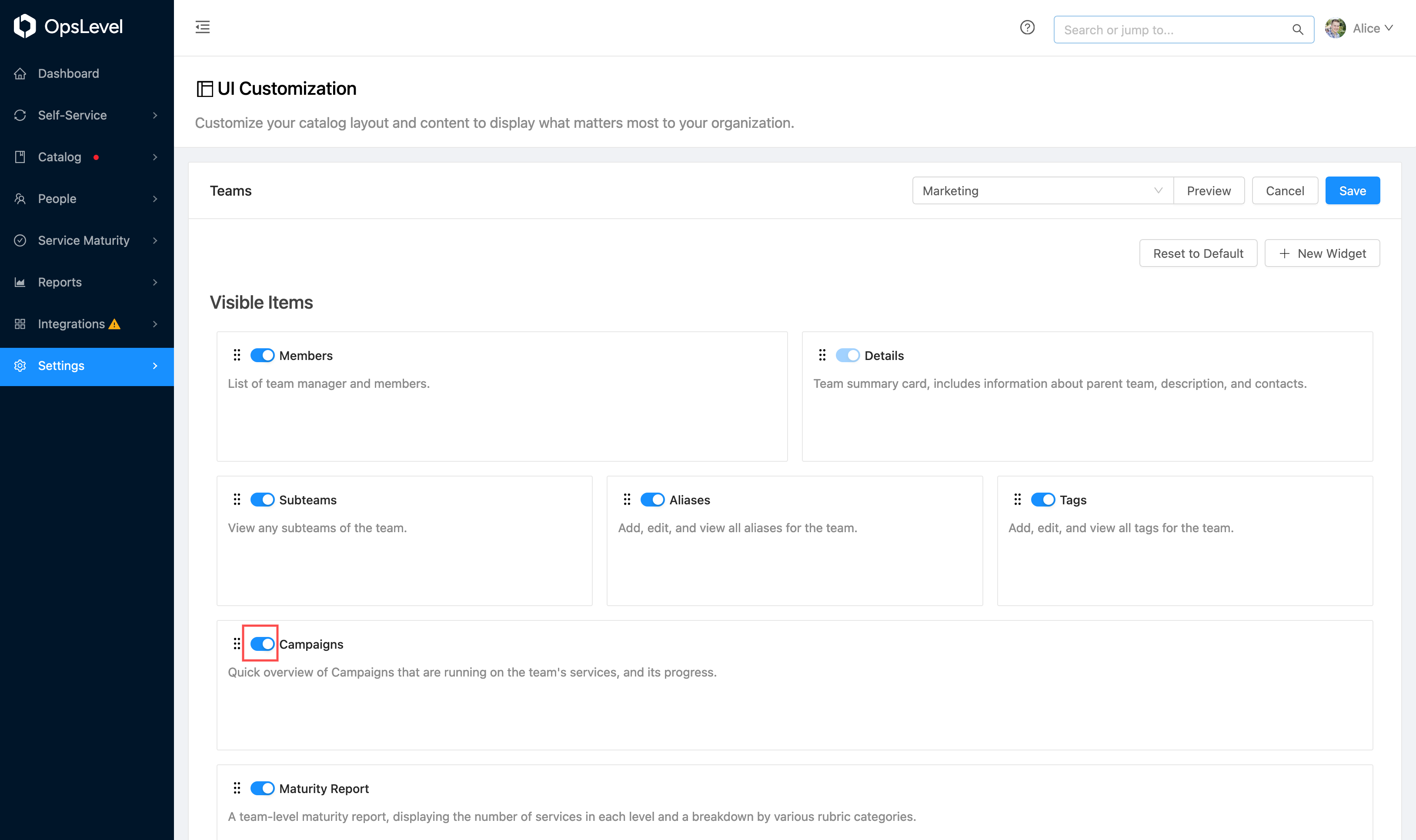
Sometimes, a widget is not useful to your organization's teams or services. In those cases, you can disable the widget by toggling the visibility of the widget.
Toggle Widget View
To re-enable the widget, you can find the disabled widget in the Hidden Items section at the bottom of the page.
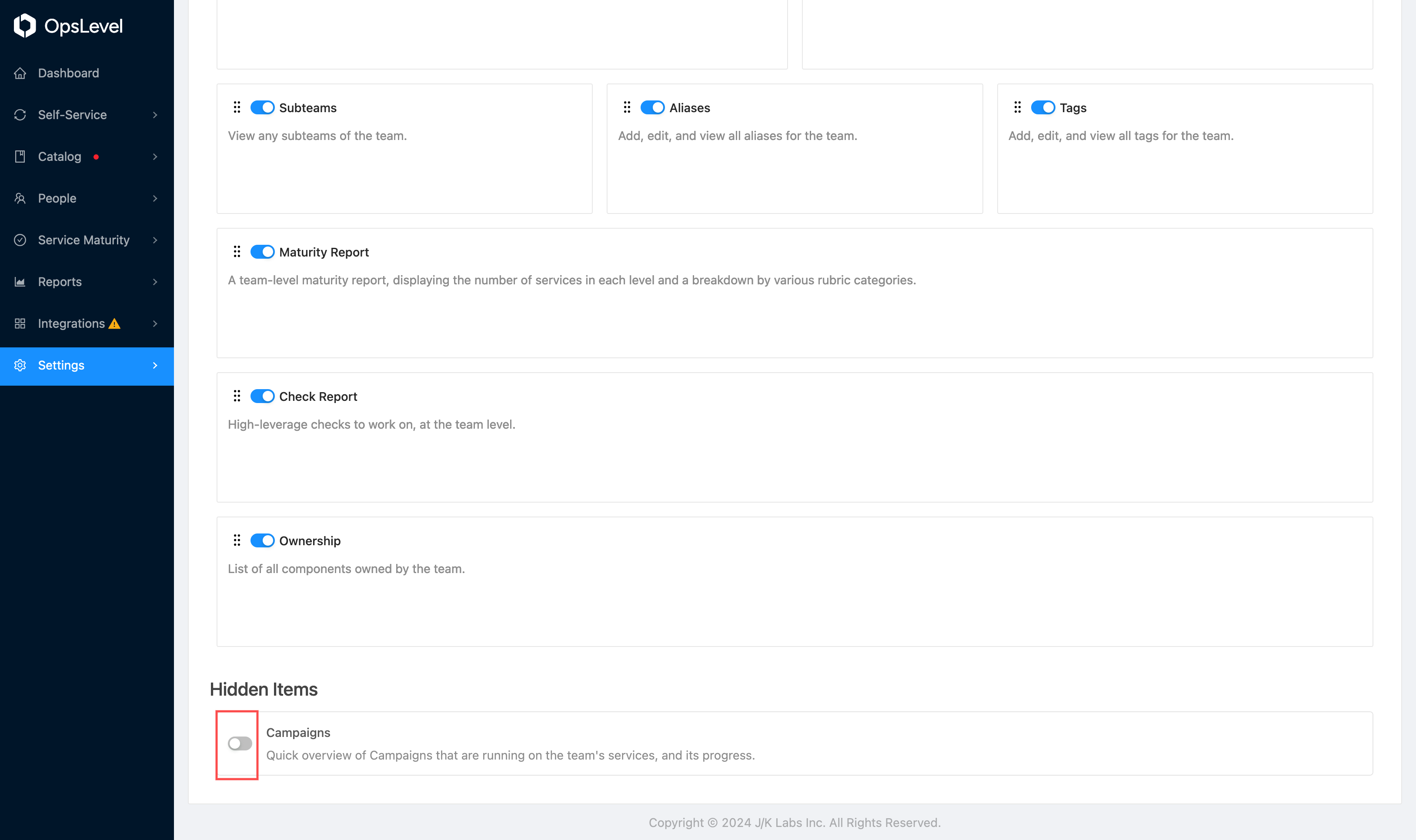
Hidden Items View
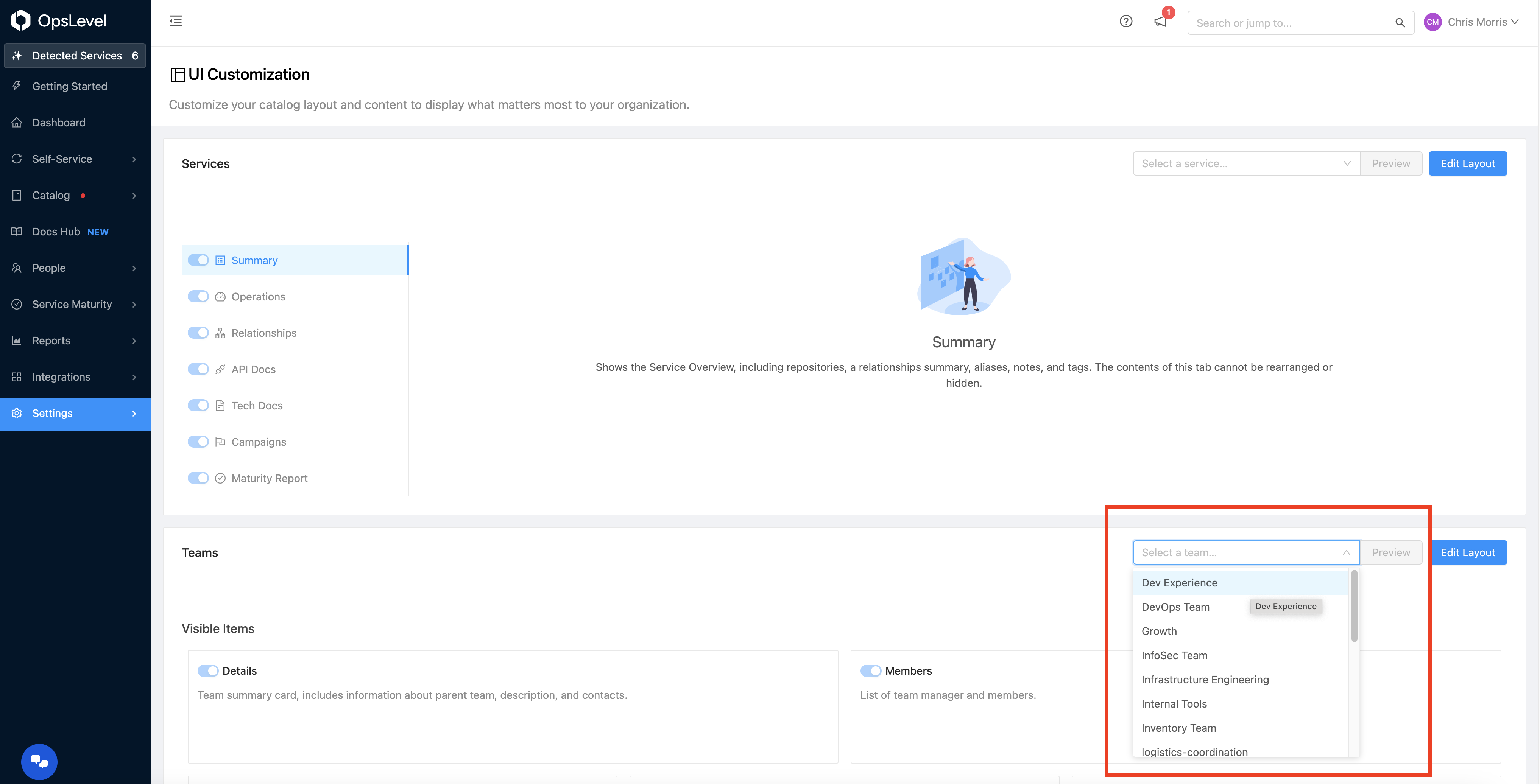
Previewing
You can (and should) preview your layout as a particular team or service to ensure that the new layout does not look too compressed and shows information as you expect by selecting a team or service and clicking the Preview button.
Preview Selection View
The preview modal shows the view as it will appear on the selected team or service page. When previewing a service, it will show the preview of whatever tab you currently have selected.
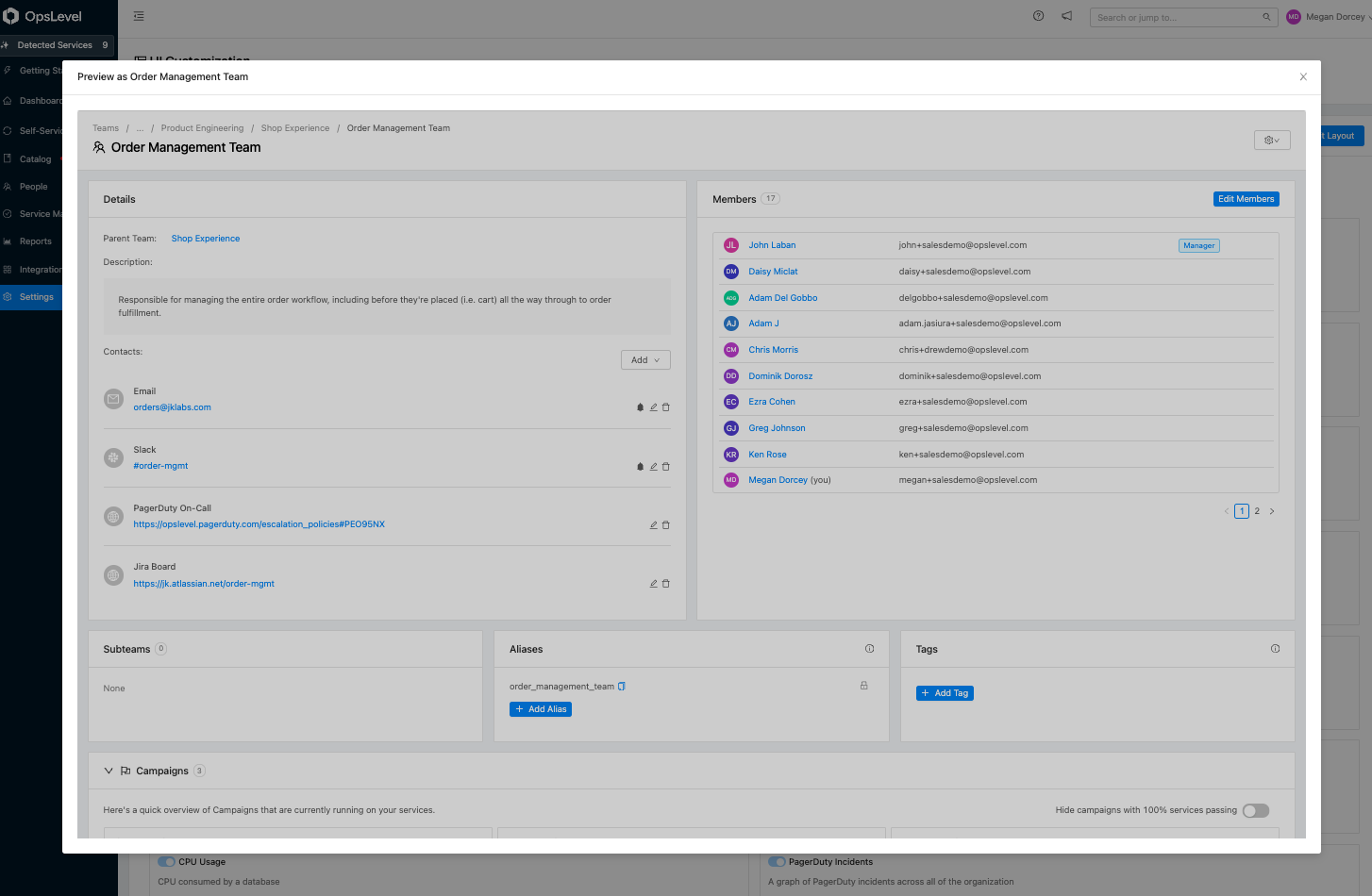
Preview Result View
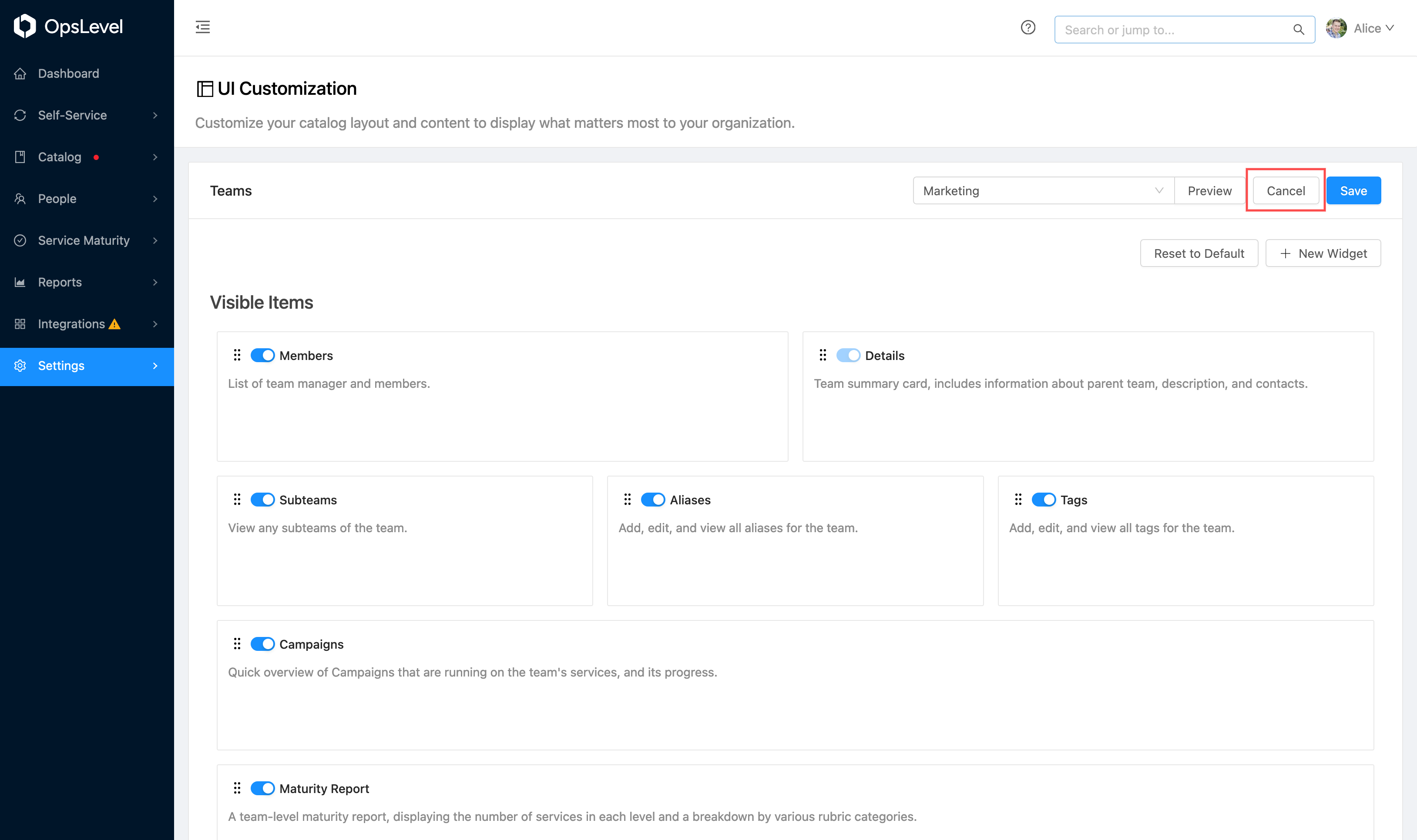
Canceling and Resetting
If you want to revert to your previously saved state, discarding your updates since you last saved, you can do so by pressing the Cancel button.
Cancel Button
If you want to discard all of your changes, including custom widgets that you or others might have created, you can press the Reset to Default button. This will revert all changes and remove all saved configurations.
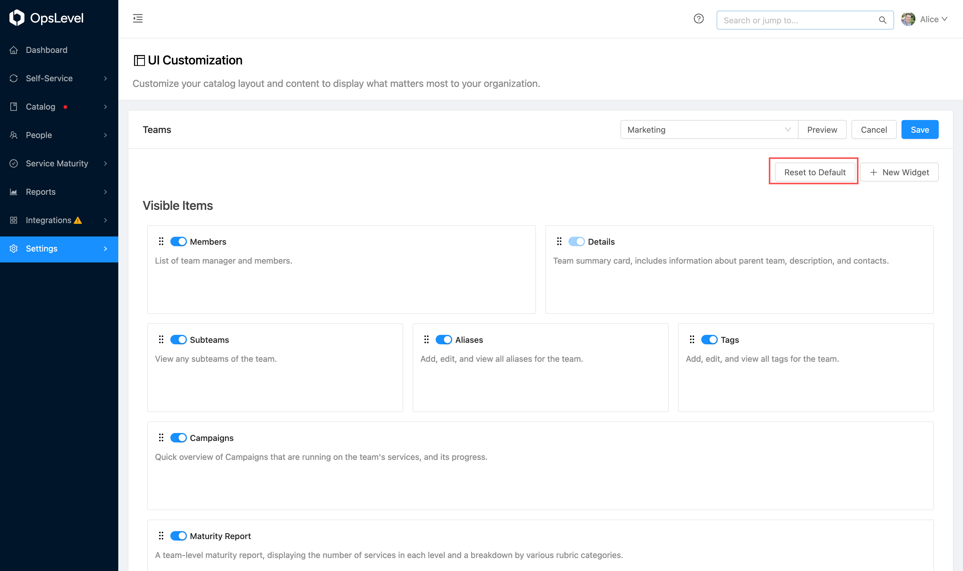
Reset to Default Button
Saving
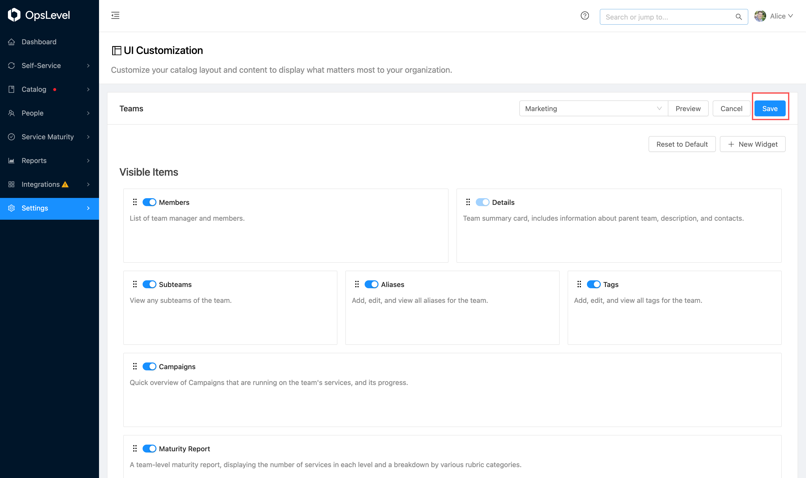
Once you are happy with the new layout, you can exit Edit mode by pressing the Save button.
Save Layout View
Once you are finished editing the view, the changes will persist on your account for all users.
Pre-Built Widgets
In addition to rearranging and hiding widgets, you can add widgets to the page for all of your teams and services. Sometimes these widgets will be the same for each team/service, and other times you can use liquid templates to allow each resources widget to render different content.
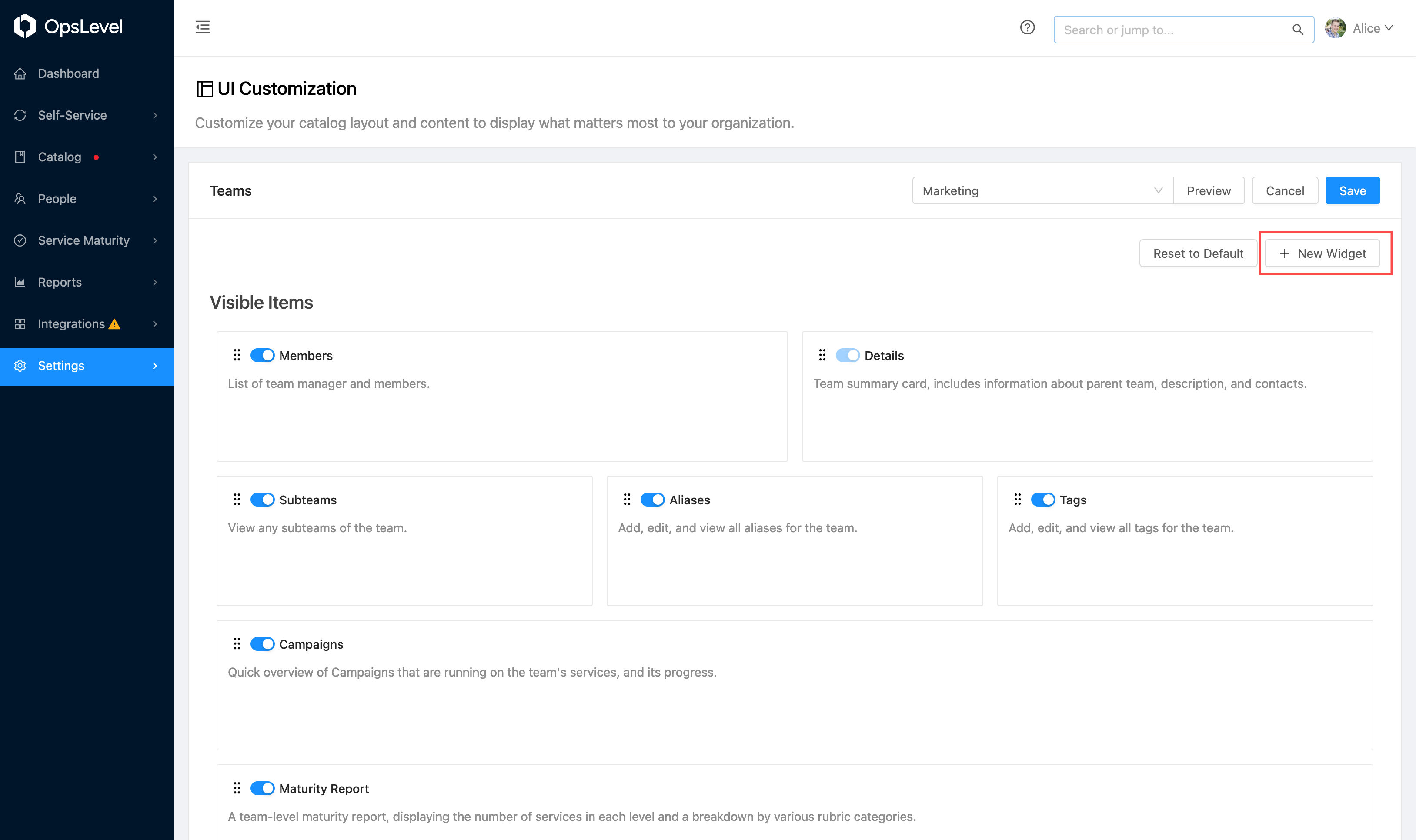
To begin, press the New Widget button.
New Widget Button
You will then be offered a choice of what type of widget to add.
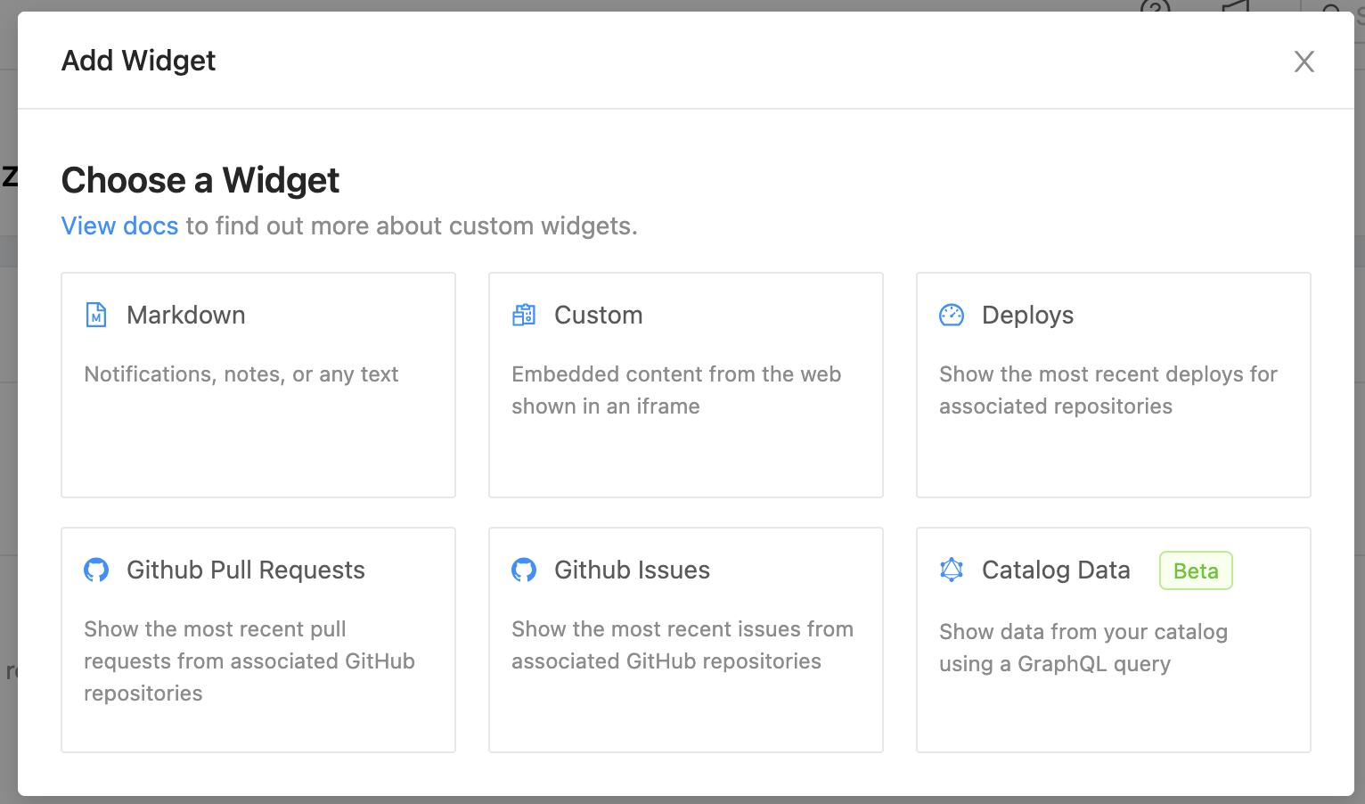
Widget Selection
Markdown Widgets
Markdown widgets allow embedding any markdown content onto your dashboard, team or service pages. This can be useful for announcements, onboarding, or documentation.
Enter the title of the widget card, an optional description, and the content (which can use liquid templates for custom content per resource).
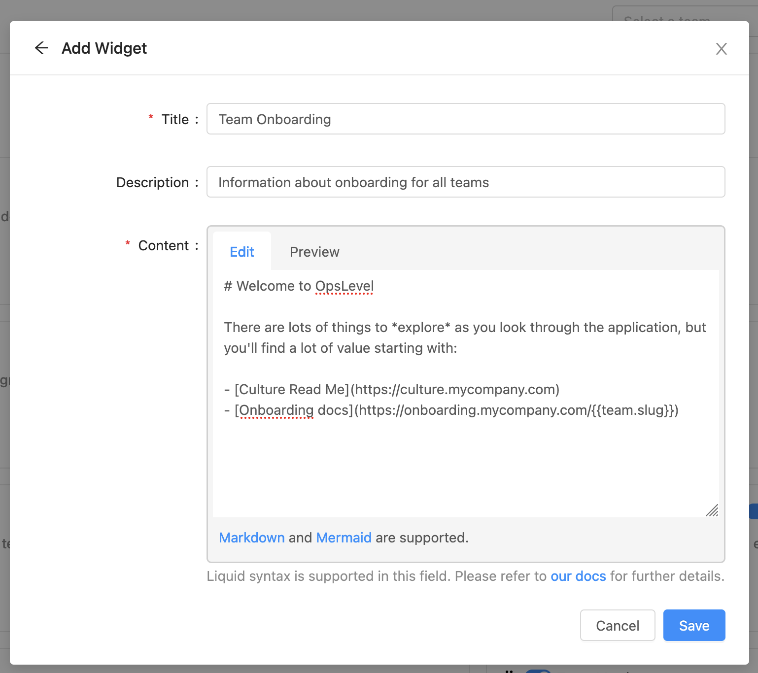
New Widget Modal
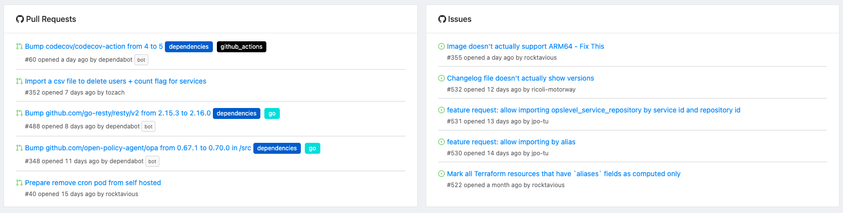
GitHub Widgets
Our GitHub widgets display information about pull requests and issues on service, team, and dashboard pages. The displayed information is based on the GitHub repositories linked to the relevant context:
- Component pages: Repositories linked to the component.
- Team pages: Repositories linked to the components owned by the team.
- Dashboard pages: Repositories linked to the components owned by all the teams of which the user is a member.
Note that if you use the GitHub App authentication method, you may need to approve an additional repository issues permission in order to use the issues widget.
GitHub Widgets
GitLab Widgets
Our GitLab widgets display information about merge requests and issues on service, team, and dashboard pages. The displayed information is based on the GitLab repositories linked to the relevant context:
- Component pages: Repositories linked to the component.
- Team pages: Repositories linked to the components owned by the team.
- Dashboard pages: Repositories linked to the components owned by all the teams of which the user is a member.
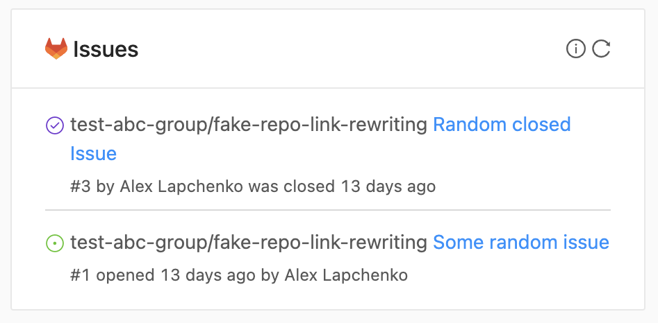
GitLab Issues widget
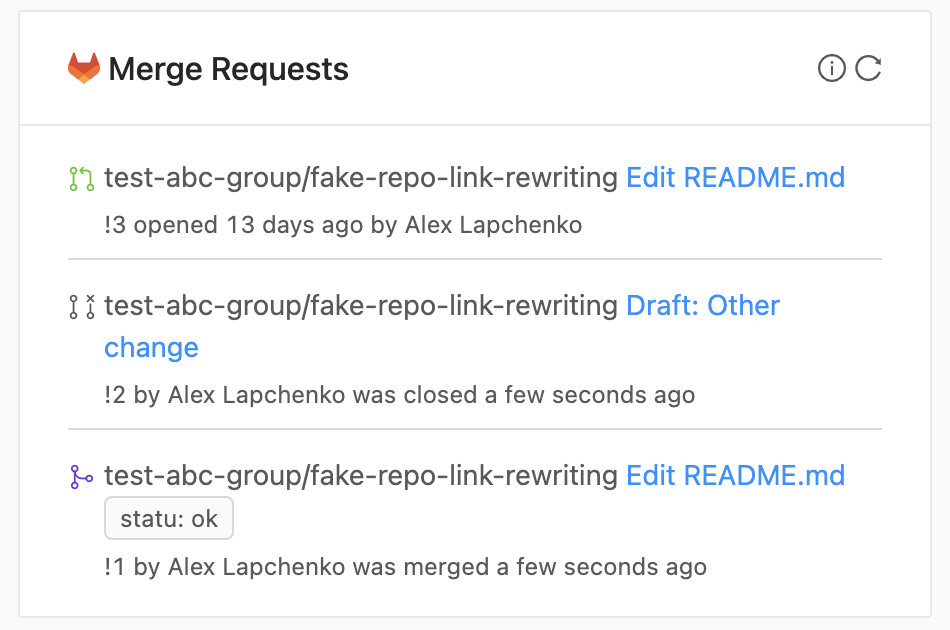
GitLab Merge Requests widget
Deploy Widgets
Deploy widgets allow you to view the most recent deploys on service, team and dashboard pages. Information will be displayed about the most recently received deploy for all environments which the service has been deployed to. If teams own multiple services, the widget will display expandable sections for each service on the team page.
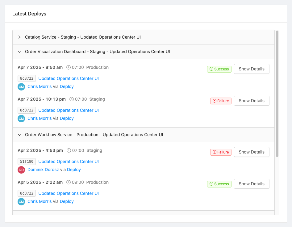
Deploy Widget
Action Widgets
Action widgets allow triggering a custom action from your service, team and dashboard pages. For custom actions on service pages that are scoped to a service, they will auto-select that service, similar to how actions from the service page work.
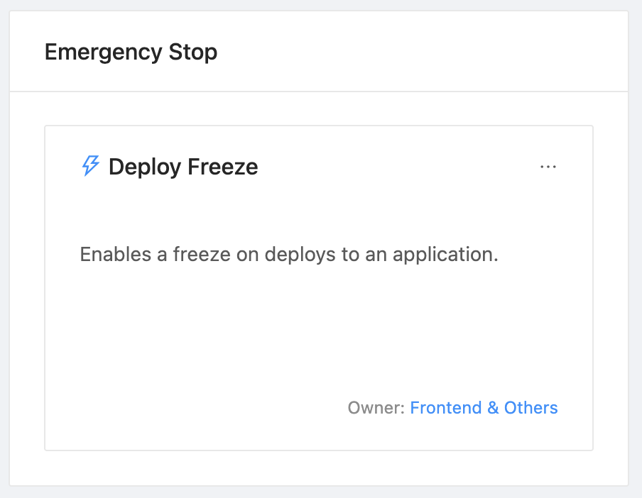
Action Widget
Catalog Widgets
Catalog Widgets are currently in Beta.We are currently working to make the creation of widgets that allow maximum flexibility while being easy to create. As we are changing these fairly frequently, they are currently in Beta status and we are looking for feedback. Things might change in the creation process!
OpsLevel's catalog contains a lot of information about teams, components, and other resources. The Catalog Data Widgets enable you to highlight specific pieces of information from the catalog. Any data that is provided on our GraphQL API can be surfaced in a Catalog Data Widget.
Pie Chart Widgets
Pie Chart Widgets allow for visualizing data from a GraphQL Query as a pie chart. You must provide a query (testable via the GraphiQL playground) and define the path to the list of items to aggregate, as well as the field to group by, in the query results.
Beta Limitations: As we are working on this widget, there are a few limitations for the moment:
- No grouping of value ranges is currently available (each value is grouped by exact matches)
Several examples of the Pie Chart Widget Creation and Display
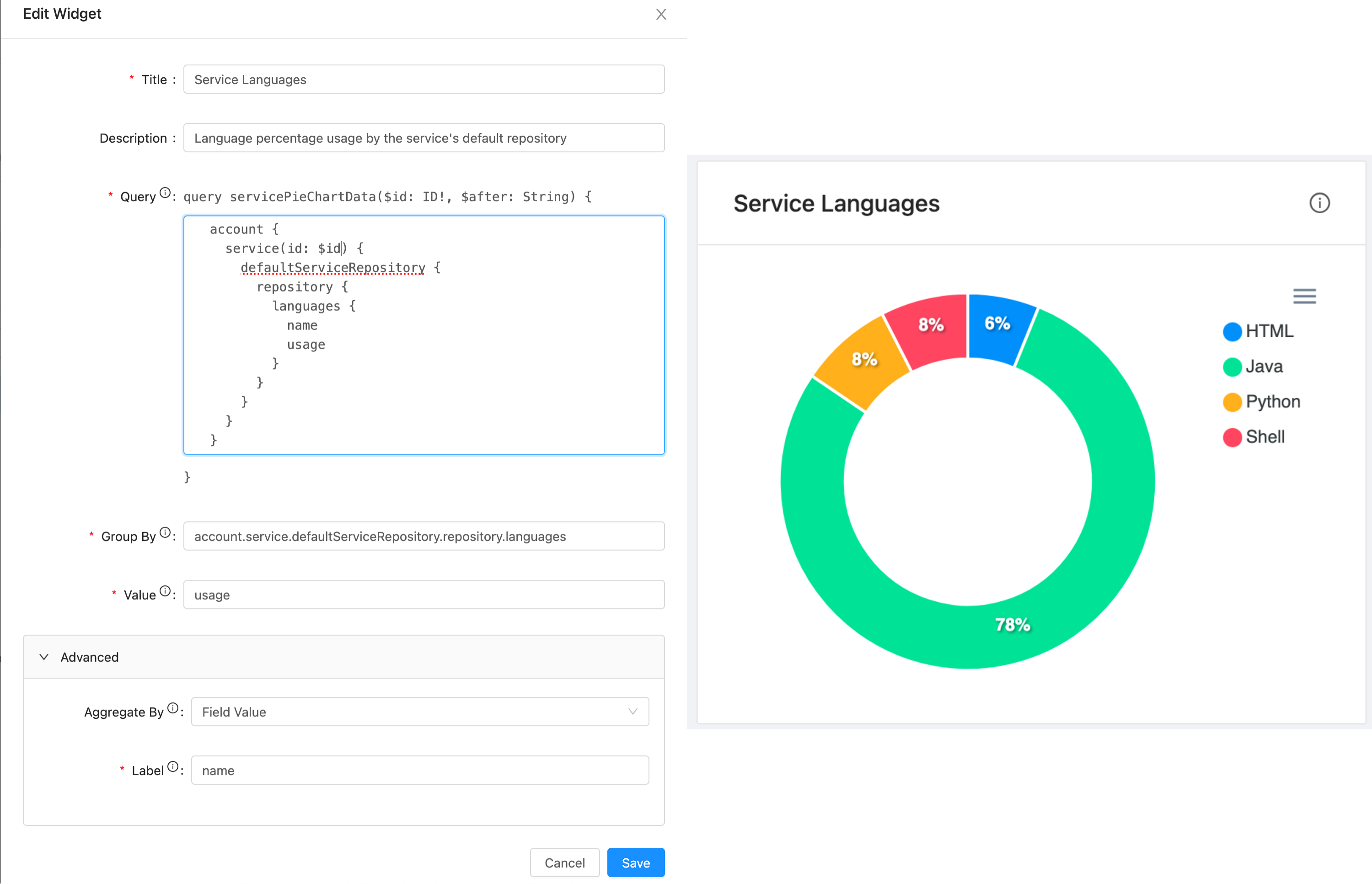
Languages with Field Value aggregation
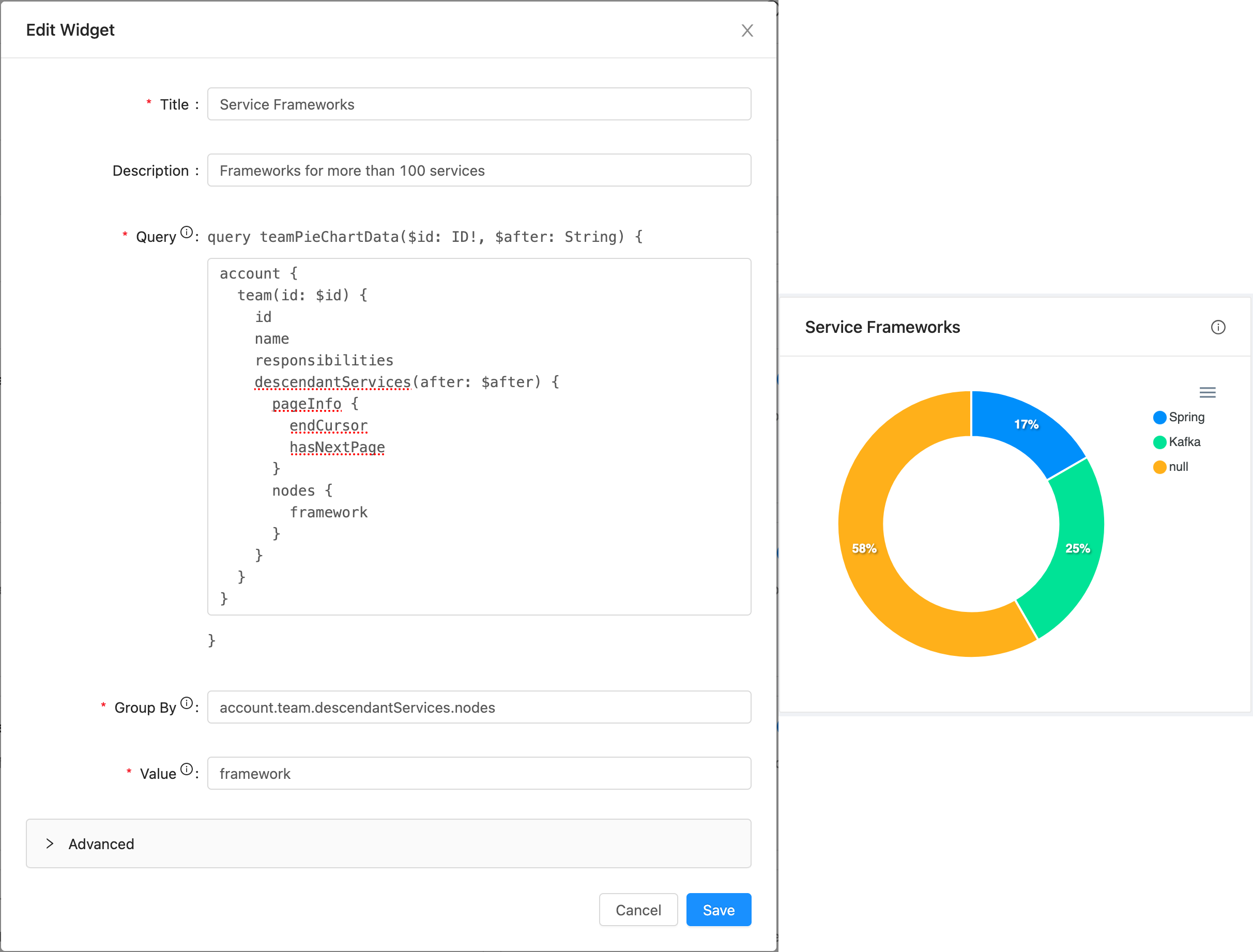
Frameworks with parameters for more than 100 records
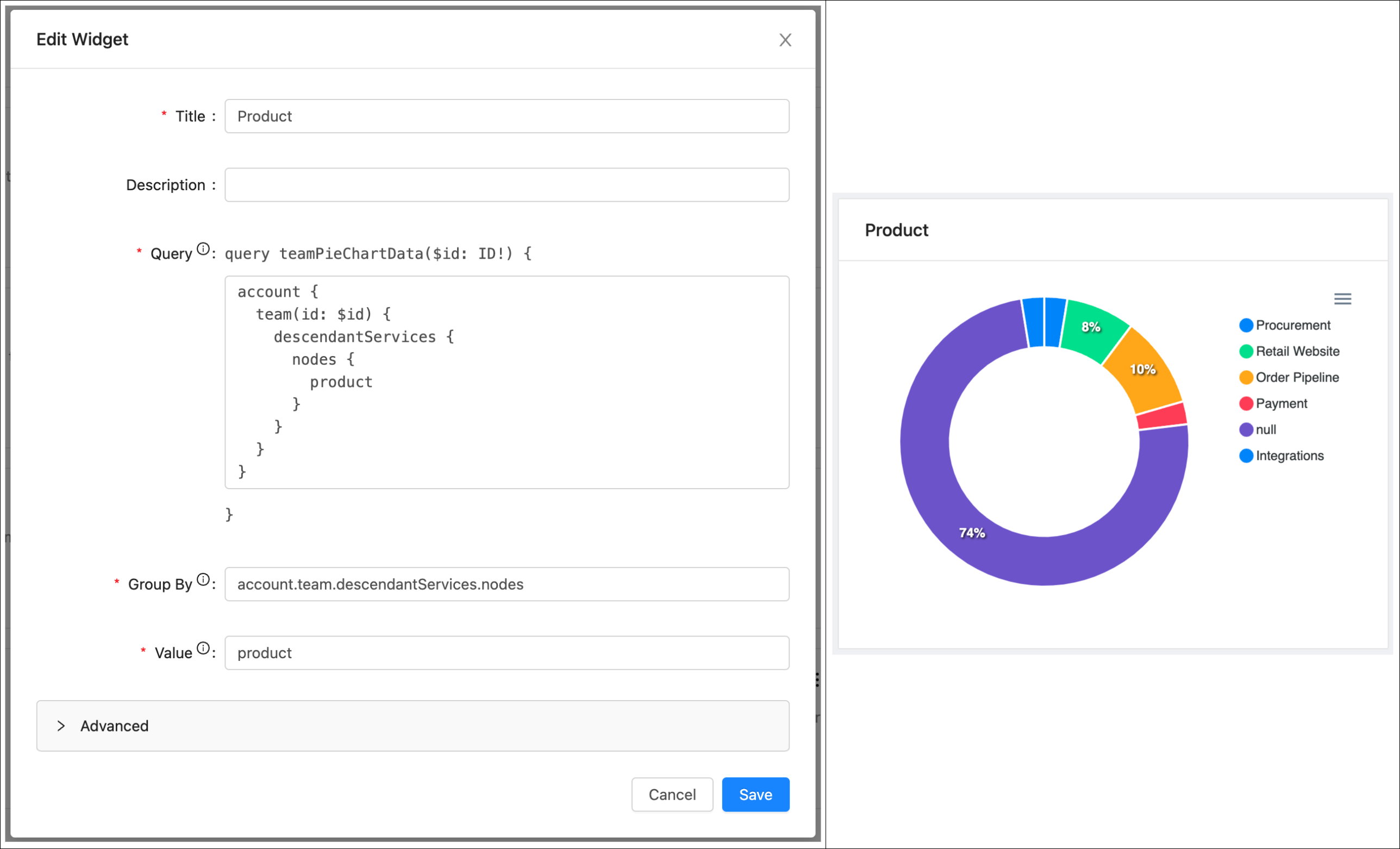
Products
Value Widgets
Value Widgets allow for exposing a single value from a GraphQL Query as a large styled widget. You must populate a query (testable via the GraphiQL playground) and then specify the path to the relevant value in the query results. Style overrides are provided that accept any CSS to apply to the widget value.
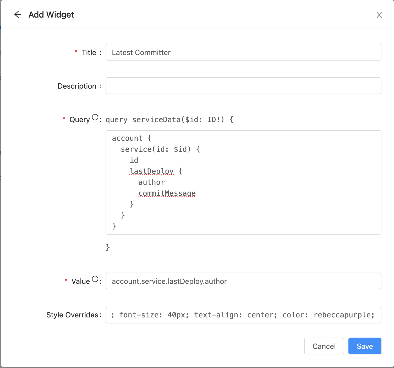
Value Widget Creation
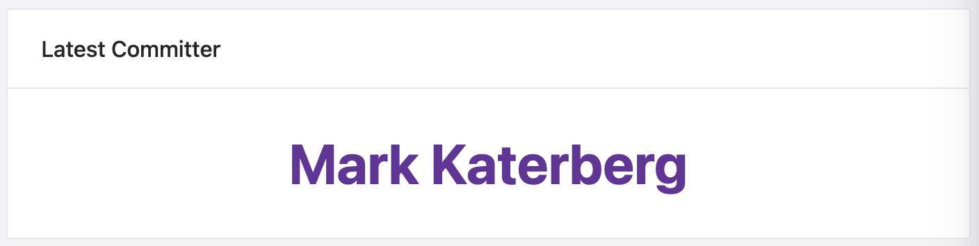
Value Widget
Custom Widgets
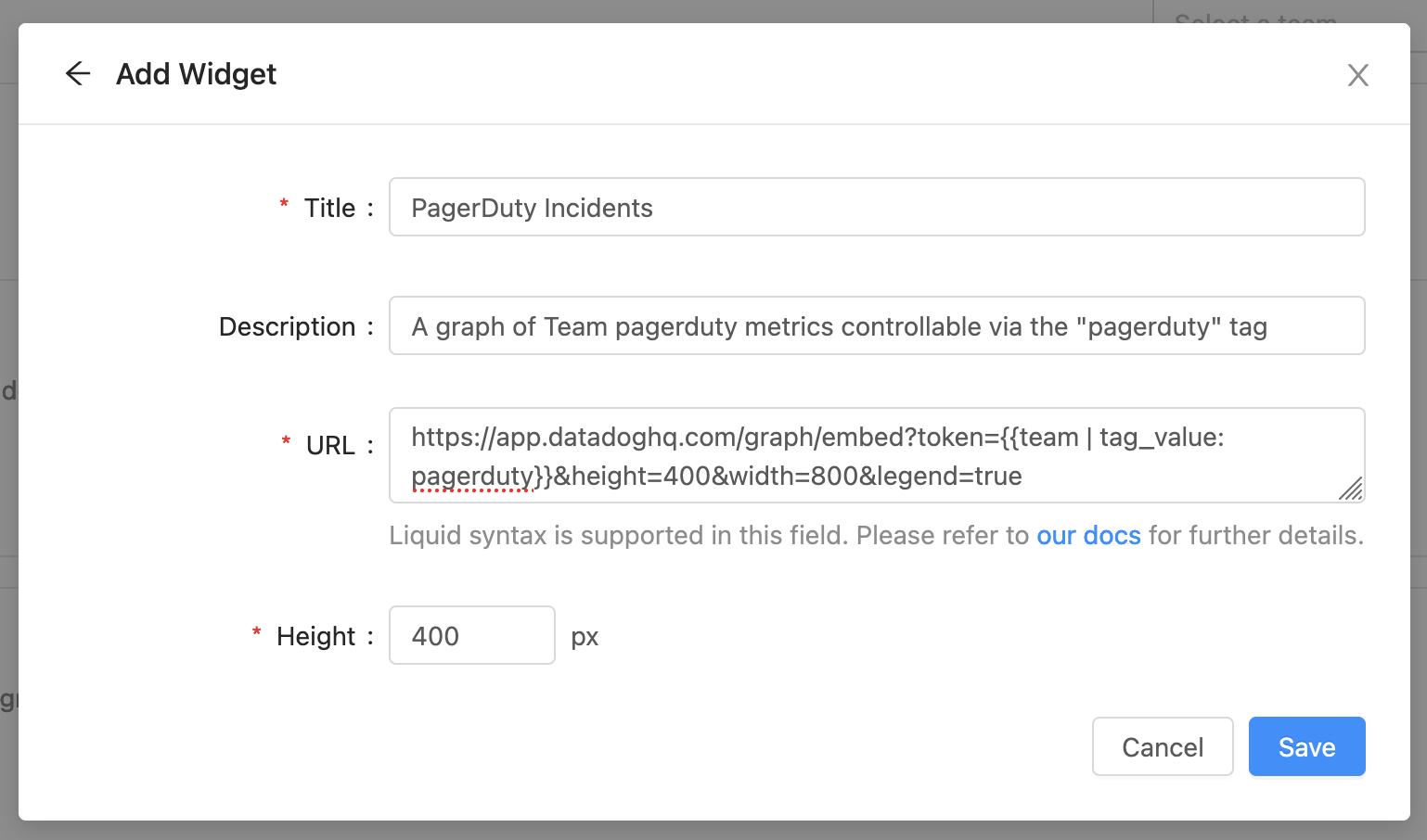
Custom widgets allow embedding content from external websites into your resource's page.
There are several caveats on what types of websites can be rendered in a custom widget. See the explanation about what can be included.
Enter the title of the widget card, an optional description, the URL (which can use liquid templates for custom content per resource), and the minimum height of the content.
New Widget Modal
Liquid Templating
A custom widget's URL field supports liquid templating. When templates are evaluated, they receive a context object. This allows the action to behave dynamically based on the information in the resource's context.
Context fields are accessed using Liquid's double handle bar notation: {{ identifier }}. When evaluated this would be replaced by the matching value in the context. Services (available on the service page), teams (available on the team page), and user (available on the dashboard) have different context fields.
Team
On a team's page, information about that team is available via liquid templates.
The Team context contains the following properties:
| Description | |
|---|---|
| team.href | A link to the HTML page for the team. |
| team.id | The unique identifier for the team. |
| team.name | The display name of the team. |
| team.contacts | An object representing the contacts for the team. |
| team.manager | An object representing the manager of the team. |
| team.slug | The URL friendly name of the team. |
| team.service_stat | An object representing the stats about the team's service statistics. |
| team.tags | An object representing the tags for the team. |
Filters
In addition to Liquid’s standard filters, we also support:
contacts_by_display_name
Find contacts by their display name
- Input:
{{ team | contacts_by_display_name: 'pagerduty' }} - Output:
\[contact_1, contact_2\]
tag_value
Returns the value of the first matching tag.
- Input:
{{ team | tag_value: "version" }} - Output:
"3.2.1"
tag_values
Returns the array of matching tag values.
- Input:
{{ team | tag_values: "ip" }} - Output:
\["1.1.1.1", "2.2.2.2"\]
This can be combined with the standard filters to extract specific values:
- Input:
{{ service | tag_values: "ip" | last }} - Output:
"1.1.1.1"
Service
On a service page, information about the service that is being viewed is available via liquid templates.
The Service context contains the following properties:
| Description | |
|---|---|
| service.href | A link to the HTML page for the service. |
| service.id | The unique identifier for the service. |
| service.name | The display name of the service. |
| service.owner | An object representing the owner of the service. |
| service.slug | The URL friendly name of the service. |
| service.tags | An object representing the tags for the service. |
| service.tools | An object representing the tools for the service. |
| service.properties | An object containing all custom properties for the service via their identifier e.g. service.properties.property_value |
Filters
In addition to Liquid’s standard filters, we also support:
tag_value
Returns the value of the first matching tag.
- Input:
{{ service | tag_value: "version" }} - Output:
"3.2.1"
tag_values
Returns the array of matching tag values.
- Input:
{{ service | tag_values: "ip" }} - Output:
\["1.1.1.1", "2.2.2.2"\]
Dashboard
On the dashboard, information about the particular user accessing the dashboard is available via liquid templates.
The User context contains the following properties:
| Description | |
|---|---|
| user.id | The unique identifier for the user. |
| user.name | The display name of the user. |
| user.role | The role of the user. |
| user.email | The email of the user. |
| user.tags | An object representing the tags for the user. |
Filters
In addition to Liquid’s standard filters, we also support:
tag_value
Returns the value of the first matching tag.
- Input:
{{ user | tag_value: "version" }} - Output:
"3.2.1"
tag_values
Returns the array of matching tag values.
- Input:
{{ user | tag_values: "ip" }} - Output:
\["1.1.1.1", "2.2.2.2"\]
Updated 7 months ago