Configuring Actions Manual Inputs
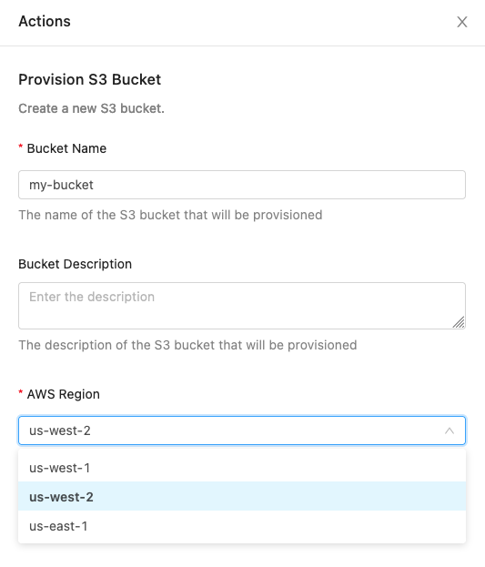
Manual inputs allow users to add contextual information to an action as it is being invoked. They are defined using YAML markup. The screenshot below shows an example of manual inputs configured for an action that allows a developer to provision an S3 bucket:
The schema supports two root level keys:
| Description | |
|---|---|
| version | The schema version (current version: 1). |
| inputs | A list of input objects. See the Input Object Schema for more information. |
Example configuration (this configuration is the yaml that drives the example screenshot above):
Input object schema
All inputs require the following properties:
| Property | Required | Description |
|---|---|---|
| identifier | true | Define how to reference the input’s value from the action’s context. |
| label | true | The input title displayed to the invoking user. |
| type | true | Supported types: text_input, text_area, and dropdown. |
The input schema also contains additional optional properties. Whether or not these optional properties are allowed can depend on the value provided to the type property.
| Property | Description | text_input type | text_area type | dropdown type |
|---|---|---|---|---|
| binding | The configuration details for fetching catalog data to populate the values for a dropdown input. Note: exactly one of binding or values must be set for inputs with dropdowntype. | ❌ | ❌ | ✅ |
| defaultValue | The initial value for this input. | ✅ | ✅ | ✅ |
| defaultValueExpression | A jq expression for the initial value of this input. Allows for dynamic default values based on other manual inputs. Note: only one of defaultValue or defaultValueExpression may be used for a field. | ✅ | ✅ | ✅ |
| description | Additional information displayed to the invoking user. This field supports Markdown. | ✅ | ✅ | ✅ |
| maxLength | The invoking user will receive an error if they invoke the action with a value longer than maxLength. | ✅ | ✅ | ✅ |
| multiple | Indicates the field supports selecting multiple values, if set to true. Defaults to false if not provided. | ❌ | ❌ | ✅ |
| pattern | The invoking user will receive an error if they attempt to submit an input which does not match this regular expression. Note: Backslashes must be escaped. \\w must be written as \\\\w. | ✅ | ✅ | ❌ |
| placeholder | The input placeholder displayed to the invoking user. | ✅ | ✅ | ❌ |
| required | The invoking user will receive an error if they invoke the action without providing a value to this input. | ✅ | ✅ | ✅ |
| sensitive | Indicates the field contains a sensitive value (e.g. a password). The value will be obfuscated when executing the action and when viewing the execution history. | ✅ | ❌ | ❌ |
| values | The select options available to the invoking user. Note: exactly one of binding or values must be set for inputs with dropdowntype. | ❌ | ❌ | ✅ |
| visibilityExpression | A jq expression for the visibility of this input. Allows for conditional visibility based on other manual inputs. Fields are visible by default unless visibilityExpression is defined and does not evaluate to true. | ✅ | ✅ | ✅ |
Values Schema
The values array allows for two methods of configuration:
-
Value only:
values:
- value1
- value2
-
Value and Display:
values:
- value: value1
display: display 1 - value: value2
display: display 2
- value: value1
Binding Schema
The binding option allows the use of catalog data in Actions dropdowns, and replaces manual enumeration of dropdown options. This ensures that dropdown data is in sync with the catalog. The following properties are supported for the binding object.
| Required | Description | |
|---|---|---|
| resource | true | The named OpsLevel resource used to populate the dropdown items. Supported values: environments, teams, systems, domains, and infrastructure. |
| filters | false | An array of filters, each with a field key and a value key, used to limit the field to a subset of the bound resources. Only valid when resource is set to infrastructure. |
The following filter fields are supported for the infrastructure resource binding:
| Description | |
|---|---|
| provider_resource_type | The type of the resource according to the upstream provider (e.g. "EC2", "RDS", "S3", etc). |
| source.external_account_id | The account ID of the source integration (e.g. the AWS account ID). |
| source.type | The type of the source integration (e.g. "AWS", "GCP", etc). |
| type | The type of the infrastructure resource in OpsLevel (e.g. "Compute", "Database", "File Storage"). |
Dropdown configuration examples
Visibility and Default Value Expressions
visibilityExpression and defaultValueExpression must be valid jq expressions. For both expressions, other inputs in the form can be accessed under .manualInputs using their identifiers.
By default, inputs are visible unless visibilityExpression is defined and evaluates to something other than true. defaultValueExpression enables dynamic default values based on other manual inputs. Note that only one ofdefaultValueExpression or defaultValue may be used for a given field.
If the action applies to services, the default properties of the service along with the aliases, tags, id, name, description, and any custom properties on the service can be accessed when setting the defaultValueExpression under .service. Custom properties on the service are also available, provided that the values of the properties are not objects or arrays of objects. The full list of accessible properties can be found below:
| Property | Schema | Sample JQ Access Patterns |
|---|---|---|
id | String | .service.id |
name | String | .service.name |
description | String | .service.description |
language | String | if .service.language == "Python" then "python3.13" else end |
product | String | .service.product |
aliases | String[] | `[.service.aliases[]? \ |
properties | `{[key: String]: String \ | Boolean \ |
tags | \{key: String, value: String\}[] | `[.service.tags[] \ |
lifecycle | \{description: String, id: String, index: number, name: string\} | .service.lifecycle.name |
tier | \{description: String, id: String, index: number, name: string\} | .service.tier.name |
The example below lets users choose an environment, bucket name, region and if versioning is enabled. The default value of the environment is being set based on whether or not the service has an alias containing the substring "production". If Production has been selected for the environment, then the default value for region becomes us-east-1 and the Enable Versioning field becomes visible.
---
version: 1
inputs:
  - identifier: environment
    displayName: Environment
    type: dropdown
    values:
      - Staging
      - Production
    defaultValueExpression: .service.properties.environment
    required: true

  - identifier: bucket_name
    displayName: S3 Bucket Name
    type: text_input
    placeholder: Enter the bucket name
    required: true

  - identifier: region
    displayName: AWS Region
    type: dropdown
    values:
      - us-east-1
      - us-west-1
      - eu-central-1
    defaultValueExpression: |
      if .manualInputs.environment == "Production" then "us-west-1" else "us-east-1" end
    required: true

  - identifier: enable_versioning
    displayName: Enable Versioning
    type: dropdown
    values:
      - "true"
      - "false"
    visibilityExpression: .manualInputs.environment == "Production"
    defaultValue: "true"
    required: true
Updated 7 months ago